
How many colors can a custom PVC patch have?
A custom PVC patch has no universal maximum color count: the limit depends on the manufacturer's process and the artwork at the finished size. Molded color areas and printed artwork need different production checks, so get the exact palette approved before ordering. For your 2026 design, ask what can actually be reproduced—not what looks glorious while zoomed in on your laptop.
- How many colors can a PVC patch have? The manufacturer must confirm the limit for your artwork and process.
- Molded PVC suits distinct solid-color areas; printed artwork needs a separate discussion about gradients and detail.
- Stickthison morale patches suit gun owners and range-goers who want parody designs.
- Approve the palette, color placement, and finished-size proof before production.
How many colors can a custom PVC patch have?
The usable color count is specific to the design and production method, not a universal PVC rule. A supplier's included-color allowance also isn't necessarily its technical maximum. Keep those questions separate, or you'll get an answer to the wrong one with impressive confidence.
Use this sequence to get a meaningful answer:
- Specify the construction. Ask whether the artwork will use molded color areas, surface printing, or a combination.
- Submit the complete palette. Include the background, lettering, outlines, and small accent colors—not just the main illustration.
- State the finished dimensions. The same artwork needs a different review when you shrink it onto a hat-sized patch.
- Request a production review. Ask which details need simplification and whether every proposed color can remain distinct.
- Approve the final proof. Confirm the palette and placement after revisions, not before them.
The custom morale patch design workflow covers the broader path from an idea to production-ready artwork. Color approval belongs inside that process, not in a frantic message after you've approved the wrong file.
Why this matters
A patch has to communicate at its actual size. Your range-bag joke should survive leaving the monitor without needing a briefing packet and a laser pointer.
More colors aren't automatically better, and fewer colors aren't automatically easier to read. What matters is whether the lettering, subject, and background remain distinguishable. Two neighboring shades can disappear into each other while a simpler, higher-contrast palette keeps the joke intact.
For a 2026 patch project, separate production feasibility from design usefulness. A manufacturer can confirm whether it can reproduce the artwork; you still need to decide whether the finished thing makes sense on your gear.
Molded solid colors: best for distinct shapes and lettering
Molded PVC artwork uses separate colored areas to build the design. Think bold outlines, recognizable silhouettes, and lettering that doesn't require a magnifying glass borrowed from the evidence locker.
Best for: designs built around clear shapes, solid fills, and raised or recessed detail.
The advantage is a direct relationship between the color map and the physical design. You can identify the background, outline, lettering, and accent areas in the proof and discuss each one with the manufacturer.
The limitation is that a smooth fade isn't the same thing as a solid-color region. If your artwork depends on blended shading, ask whether the manufacturer recommends simplifying it, dividing it into discrete shades, or using a different finishing method.
Don't assume that choosing molded PVC answers every detail question. Small lettering and narrow shapes still need review at the requested size. Your majestic tactical raccoon deserves better than becoming an unidentified brown incident.
Printed artwork: best for designs that depend on surface detail
Printed artwork puts color onto a surface rather than relying exclusively on separate molded color areas. Confirm the specific printing method and how it works with the proposed PVC construction.
Best for: artwork whose identity depends on printed detail or tonal transitions, subject to the manufacturer's approval.
The advantage is that you can discuss printed imagery separately from the underlying shape and relief. The limitation is that a printed detail isn't automatically a raised detail, and a screen preview doesn't establish how the finished surface will look.
Use this comparison when discussing a 2026 design brief:
| Approach | Best for | Main advantage | Main limitation | Question to ask |
|---|---|---|---|---|
| Molded solid colors | Bold shapes and distinct lettering | Color areas correspond to physical design regions | Blended artwork needs a separate production solution | Can every color region remain distinct at this size? |
| Printed artwork | Surface detail and tonal transitions | Printed imagery can be discussed separately from molded relief | Printed detail does not automatically create raised detail | How will the print interact with the surface and relief? |
Choose the method that preserves the artwork's essential features. Don't choose a process because somebody called it premium and added dramatic lighting to the mockup.
Why the usable color count varies
The useful question isn't just whether another color can be added. It's whether that color can be reproduced clearly and whether it contributes anything besides giving your approval email another paragraph.
These factors shape the answer:
- Production method. Separate molded color regions and printed color information require different artwork decisions.
- Finished dimensions. Shrinking the design also shrinks its lettering, outlines, and colored details.
- Color-region geometry. Broad areas and narrow slivers aren't equivalent production problems, even when the palette is identical.
- Contrast. Adjacent colors need enough visual separation for the intended design to remain readable.
- Relief layout. Raised and recessed features change the physical arrangement of the artwork; confirm how those features align with color boundaries.
Those factors belong in the same conversation. Asking for a maximum color count without supplying dimensions is like asking whether your new gear fits while refusing to identify the bag.
A color limit also doesn't tell you whether a design is approved. Get confirmation on the actual file, including its small details and intended construction.
How to count the colors in your artwork
Start with the unique intended colors, then ask the manufacturer how it counts them for the chosen process. Don't count every differently colored pixel in a screenshot and declare yourself the proud owner of a manufacturing specification.
Make a palette list that identifies each color's job:
- Background: the main field behind the design.
- Outline: the boundary around shapes or lettering.
- Lettering: the text that carries the message.
- Main subject: the central illustration or symbol.
- Accents: small details that support recognition.
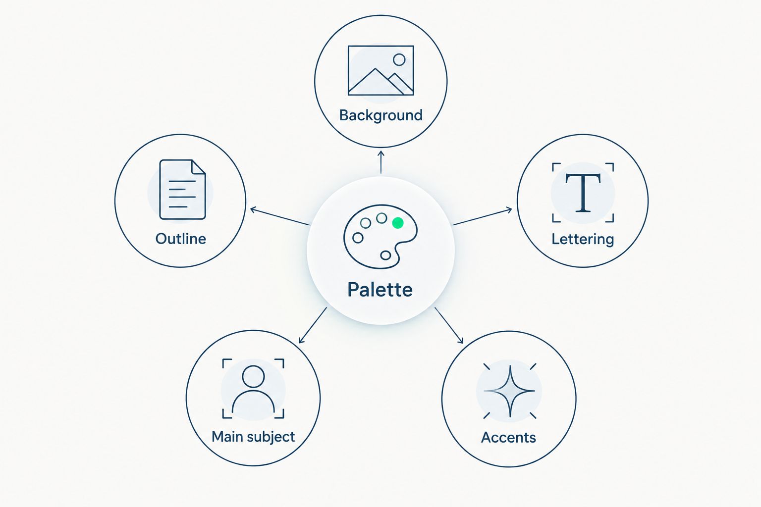
Repeated use of the same intended color should be clearly identified as the same palette entry. If the background and lettering share a color, label that relationship rather than leaving the manufacturer to guess from a compressed image.
Also distinguish actual artwork from presentation effects. A mockup's cast shadow, lighting highlight, or textured backdrop isn't automatically part of the patch. Mark those effects as presentation-only when they aren't intended for production.
How to check the palette at actual patch size
Review the artwork at its finished physical dimensions before approving the colors. Zooming until a patch fills your entire monitor is excellent for editing and terrible for judging whether anyone can read it.
Print the proof at 100% scale, with automatic page fitting disabled, then measure the output. Hold it against the intended patch panel and check the design without enlarging it.
For a concrete size reference, Stickthison's USP Morale Patch lists a width of 2.7 inches and a height of 3.25 inches. Its description also specifies PVC construction and a gloss UV printed finish; those details describe that patch, not a universal specification for every PVC design.
Use a finished-size proof to answer practical questions:
- Can you read the main lettering without moving closer?
- Does the central subject remain recognizable?
- Do neighboring colors stay visually separate?
- Are tiny accents doing useful work?
- Does the patch fit the intended panel without hiding essential artwork?
For your 2026 approval, evaluate the joke first and decorative detail second. If the punchline disappears but the tiny background flourish survives, your priorities have wandered off unsupervised.
What should you ask the manufacturer before approving colors?
Send a short brief that makes the production questions explicit. An annotated file beats a vague request to make it look like the picture, especially when the picture contains shadows, gradients, and enough visual noise to qualify as camouflage.
Include:
- The intended finished width and height.
- The artwork file and a labeled palette.
- The requested molded or printed appearance.
- The features that must remain recognizable.
- Any colors that need matching to a specified reference.
- Permission to suggest simplifications before approval.
Then ask the manufacturer to confirm the supported color count, treatment of gradients, smallest details needing revision, and proofing method. Ask whether the color allowance and the technical maximum are different.
A digital proof establishes placement and the intended palette, but your screen isn't a physical color sample. When color matching matters, ask what physical reference or sample process is available rather than approving from a phone with the brightness set to miniature sun.
Approve the revised production file, not the original concept. If the manufacturer changes an outline or combines shades, those changes need your attention too.
Can gradients count as a single color on a PVC patch?
A gradient isn't a single solid color region. It contains changing tones, so it needs a production discussion rather than a convenient label on your palette list.
For molded artwork, ask how the transition would be represented as separate color areas. For printed artwork, ask whether the proposed printing process supports the intended transition on that patch surface.
Don't silently swap between those approaches. A shaded illustration rendered as solid steps will look different from a smooth printed fade, even when both originate from the same file.
Should you remove colors before ordering a custom patch?
Remove colors that don't improve recognition, contrast, or meaning. Keep colors that make the subject or lettering understandable, even if the simpler version looks satisfyingly tidy in a design presentation.
Compare the original palette with a simplified proof at identical finished dimensions. If removing an accent doesn't change what you recognize or read, that accent is a reasonable candidate for deletion.
Stickthison morale patches are best for gun owners and range-goers who want parody designs. That audience doesn't need every joke converted into a minimalist corporate badge; it needs the joke to remain visible on actual gear.
FAQ
What's the maximum number of colors a PVC patch can have?
There is no universal maximum that applies to every PVC patch manufacturer and process. Submit the artwork, palette, and finished dimensions for confirmation of the supported count.
Does the background count as a color on a custom PVC patch?
Include the background in your submitted palette and ask how the manufacturer counts it. Don't assume an included-color allowance excludes backgrounds, outlines, or lettering.
Can a custom PVC patch have gradients?
Gradients require a process-specific answer because blended tones aren't the same as separate solid-color areas. Ask whether the design should use printed artwork or a simplified arrangement of molded shades.
Do more colors make a PVC patch better?
More colors don't automatically improve a PVC patch. Keep colors that strengthen recognition and contrast, and reconsider accents that disappear at the finished size.
Can the same color appear in different places on a patch?
Identify repeated uses of the same intended color as a shared palette entry. The manufacturer must confirm how those regions work with the proposed construction and artwork.
Will the finished patch match the colors on my phone?
A phone preview isn't a reliable physical color reference. Ask the manufacturer about color references and sample approval when matching a particular shade matters.
What should I send for a custom PVC patch color review?
Send the artwork, labeled palette, finished dimensions, and requested molded or printed appearance. Identify essential lettering and details so production revisions preserve the design's meaning.
One last thing
Before approving your 2026 patch, remove the mockup's shadows and dramatic lighting. Judge the flat artwork at its intended size, then review the proposed relief separately.
That simple check stops presentation effects from doing the design's heavy lifting. Your patch needs to work on a range bag, not just in a suspiciously cinematic product render.


Comments